|
 I like the idea of you out there painting in one of those hoganettes in the clear and dark of that llano — that starlight on snowfields and these barely readable from a distance bumps concealing
cognitive wells like hidden artesians in the badlands of S.Dak.. I like the idea of you out there painting in one of those hoganettes in the clear and dark of that llano — that starlight on snowfields and these barely readable from a distance bumps concealing
cognitive wells like hidden artesians in the badlands of S.Dak..
—Mark Robertson
This page is devoted to and about the ontology of my new PTNZ. Check back as I add things. I would appreciate any feed back on any aspect or impressions of these new paintings from anything of you that you might have to offer.
E-mail me at ronhondo@newmex.com. Thanks!
"Making painting is very, very different than looking at a painting."
"The problems of painting are WHAT color, and where do I put it?"
• MATERIALS and METHODS
Building the Shapes. . .
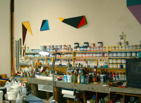
The supports for these shaped painting are constructed out of Komatex PVC. Komatex is a expanded PVC plastic similar to the plastic pipe used in plumbing. (Expanded means that tiny air bubbles are introduced during the manufacturing process, making
it much lighter and easier to work. You might have heard of it as Sintra, another brand name, both of which is most commonly used by sign makers. It is manufactured in 4 x 8' sheets in thicknesses of 1/8 to 3/4". It is rigid, but not brittle. My friend Barbara suggested I try it, but being stubborn it took me three or four years to get around to actually trying the stuff. One can
cut the 1/8" sheets with a mat knife, or precisely saw out the sides of the shapes with my table, radial, orbital, or jig saw. It can be filed and sanded (abraded) to get good paint adhesion. Expanded PVC is working well, for me. I am doing the whole thing myself, without having a studio assistant master carpenter craftsman, as I did in the 60s thru the 80s.
• PAINTS
The paints I am using in this series are manufactured by Golden Artists Colors.
www.goldenacrylics.com
I am finding that these are really high-end paints! It would be worthwhile to visit their web site, as they have a lot of useful technical information although it's not always
as advertised (based on my personal experience). For instance, the matte gels and varnishes sometimes introduce cloudiness, which is difficult to get around–especially with darker colors.
Barbara Bentley, Inside Job, 2002
|
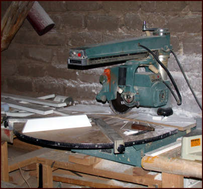
This is my original cast-iron De Walt radial saw, invented by Dr. De Walt that I acquired in 1965 with the proceeds of my first painting sale.
We have been through a lot together. Without it my shaped paintings would not be possible.
|
• Feedback
Your paintings were one of the sources of pleasure for me on your web site. I'm a sucker for colour. Maybe, like Jack Bush, I have a lust for it. One can see at a glance that you love and are expert in using it right across the palette (spectrum).
I like too the way your taking pre-ordained shapes and applying colour to them creates a three-dimensionality, so that, in a sense, the paintings become sculptures. Moreover, the pre-ordained shapes allow you to escape the "tyranny" of the canvas. You don't have to worry about where on the canvas you put the paint (all-over, up, down, center, periphery..). Your colour can
appear to be free-floating. The juxtaposition of colour also works to create a new form, or a perception of new forms, in your paintings. This, as much as anything else, gives of course the depth of field that contributes to the illusion of 3-D.
I sense from looking at your paintings, the recent ones as well as the selection from the 60s on, that you delight in playfulness. The hinges seem at times to be flying, as if free of gravity. Your Euclidean, as opposed to fractal, geometry,
with its regularity and symmetry, enables you to explore the potentiality of colour probably more intensely and fully than open-ended shapes would allow. At least the impact of the colour, because the colours are more confined and defined, is richer. What you and Newman, Bush and Noland do with colour and form is akin to what Bach did through counterpoint. Delimitation becomes no limitation.
These are perhaps superficial and obvious reactions based on a brief look at pictures of your work. I deliberately didn't read your biographical info or any of your critico-theoretical writings. Nevertheless, if I ever get to see any of your
work firsthand I would expect these observations to be confirmed rather than proved wrong. Delight, pleasure, the magical intoxication of colour, 2-D teasing 3-D, levity and movement – these are the things I get from looking at the images of your work on the site. I'm also aware you are a serious, genuine, artist – and that's a source of celebration too. Isn't it?
Peter Harris, Australia – Contributing Editor, Asian Art News |
• Your new work: Comments
Looks like you are going backward to go forward, with great success, too.
Morris Louis did something similar when he quit chasing Still and went back to his original stain pictures to make the veils. You did not chase anyone in particular that I can see, but your computer generated stuff seems like a similar detour.
Pictures like Notched Slab and other "NuShape" images seem the strongest because they are most monumental. The more complex win out over the less complex, at least on the web. (Which is a hell of a bad way to look at pictures,
so I qualify everything specific I say, though the web is effective in showing that you are doing some strong stuff.)
Your site, by the way, gets better every time I stop by. It is a
testament to how persisting is the only effective way to deal with fickle trends. We will outlast the bastards because their attention span is so short.
I appreciate the plug for newCrit too, as well as mentioning me on your artist personal page links. I bought a few domain names at buydomains.com (I switched to them from Network Solutions) and http://newcrit.org will always point
to newCrit, even if the university kicks us off their network. Similarly, http://johnlink.org will always point to my personal site.
John Link
http://newcrit.art.wmich.edu
( click on Meet the Editors) |
Your new Trompe Trapezoids on the home page is a tour de force of dimension, colour and shade, and as well Jericho–2002. My compliments.
Paul Herriott |
• Feedback, an e-mail
Subject: Four dimensional aesthetic chess anyone?
Hi,
Nice to have found your website. Sorry you have taken time off from painting.
Hope you have found some inner enlightenment during that time. Your new work is not very significant. They're like computer icons merged with Ellsworth Kelly. Your best work were the resin jobs. They had the guts and cosmic wit on par with Jackson Pollock. The waves of 1996 are good too. Nice conceptual pieces. Compact. But
this stuff you're doing now is small scale in all ways imaginable. Did I read that you experimented with sculpture? I think that is the way for you to go. I think you have to actually expand your paintings off the wall (like Frank Stella did, your cosmic partner). Use illusion but also actually build the surfaces. Have you seen optical camouflage on battleships? (WWII?) Like that. Also
use transparency in the form of colored glass or plastic sheets.
I know you're hitting 64 and may not feel up to working on a grand scale, but how old is Frank Stella? Maybe you need studio helpers? I might consider the job if you paid well enough.
Anyway. Don't give up. You have a cosmic message to make. It's just not expressed yet in its totality. Do you know what it is?
Steven Martin, Washington D.C. area |
• Feedback
You have always been a very busy man. And adventurous, always reacting and launching into new series from your previous ones. There has been an attitude of adventure
into how you could expand, refine, enlarge, poke fun at what you've done before. So your sense of play has never been hindered, thank God. More power to you!
I have always enjoyed the spatial illusionism in your work and your ability to convey visceral power through the proportions you chose for related shapes. Your sense
of color is rich and varied, revealing a great depth in the emotional process of your work. The color has always contributed to a sense of robustness coming through your work.
In your most recent series, for me, esp, the Hinge series, you are boiling things down to essentials. I really appreciate your homage to B. Newman. It is so yours and
his, the way a gut level homage should be.
Frank Ettenberg, Santa Fe (here since 1972)
|
|